
Clear cuffs: DIY
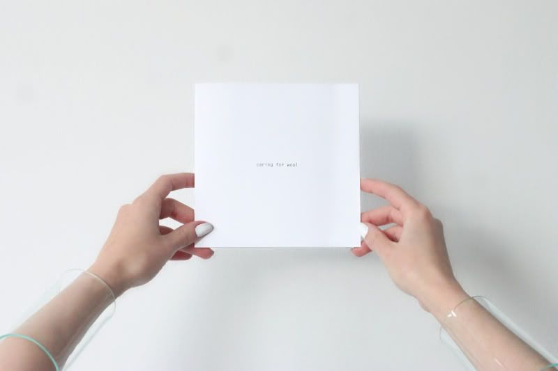
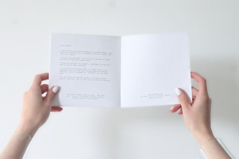
'As little design as possible' Dieter Rams would definitely approve of this little piece of printing. There, on a high table in a Stockholm boutique, in between colorful magazine covers and accessories was this high pile of white squared papers. It was not clear at all what these papers were for, no brand name in sight, no images, just the words 'caring for wool' in a tiny typewriter font. The papers looked like they just came out of your own household printer and were stapled together. It could not get any more modest and than this. The (lack of) graphic design, the ultimate simplicity, to the point of this leaflet consisting of nothing more than some dry information, made it stand out, it made it so incredibly interesting that it made you want to pick it up to explore its purpose and content. Though some might see this as boring, I think that minimizing the visuals and graphics so much, taking simplicity so far is a bold and radical decision. I like it and it worked!
In case you too are now wondering who made this; it is a guide for taking care of wool garments, made by Tangent Garment care. You can also read the full guide online here.
0 comments:
Post a Comment